

Analyse
Strategic performance intelligence. For CI leaders, operations directors, and group planning.
Improving one line is a tactical problem. Improving twenty lines across six countries with different equipment, different teams, and different legacy systems is something else. Analyse is where operational data becomes strategic evidence, showing not just what is happening, but where the effort will compound.
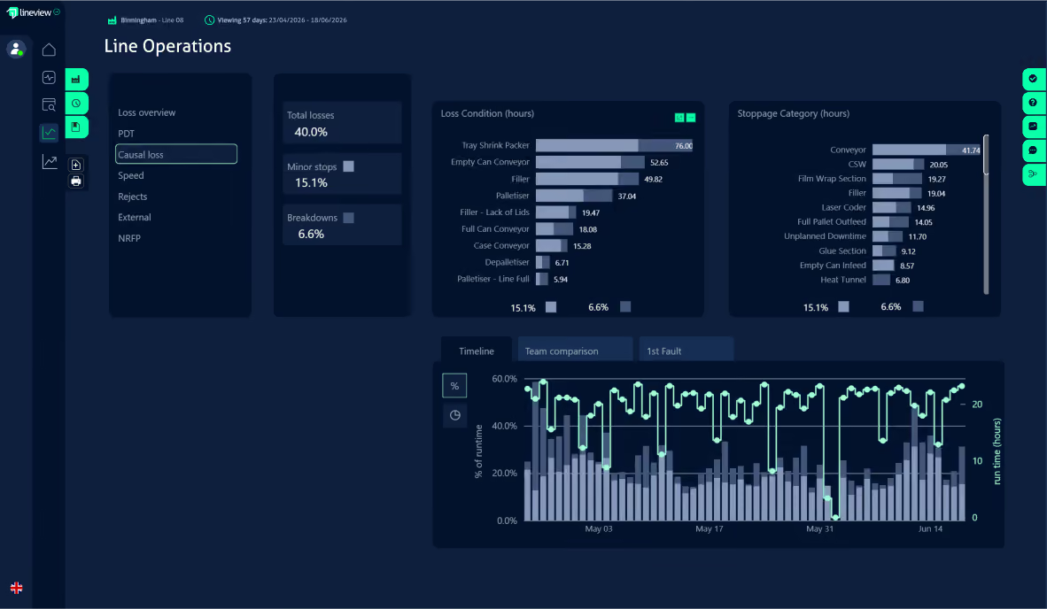








































Key Features

Long-Term Trend Analysis
Track OEE, loss categories, and equipment performance over weeks, months, and quarters. Separate genuine progress from variance. Know which plant's numbers are improving and which are drifting.

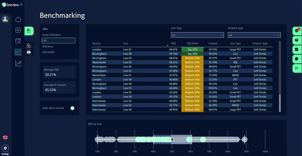
Cross-Site Benchmarking
Compare performance across lines, sites, and regions using one consistent data framework. The gap between your best and worst site, expressed in cases per shift, is usually larger than expected.

Anonymous Industry Benchmarking
Compare your OEE metrics against anonymised data from similar beverage operations globally. No data leaves your environment; you get a position relative to industry norms without sharing anything proprietary.

Focused Improvement Deep Dive
Select any causal loss and Analyse breaks it down: frequency, duration, shift patterns, trend over the last 90 days, correlation with SKU or crew. The evidence base for a focused improvement project, built in seconds.

Task Management Dashboard
See open tasks, completion rates, overdue actions, and, critically, whether closed tasks moved the OEE needle. Connects the improvement pipeline to actual production results.

Routines Dashboard
Track completion of shift routines across crews, lines, and sites. Where routines slip, performance typically follows. This view makes the correlation between execution discipline and output visible.
KPI Analysis
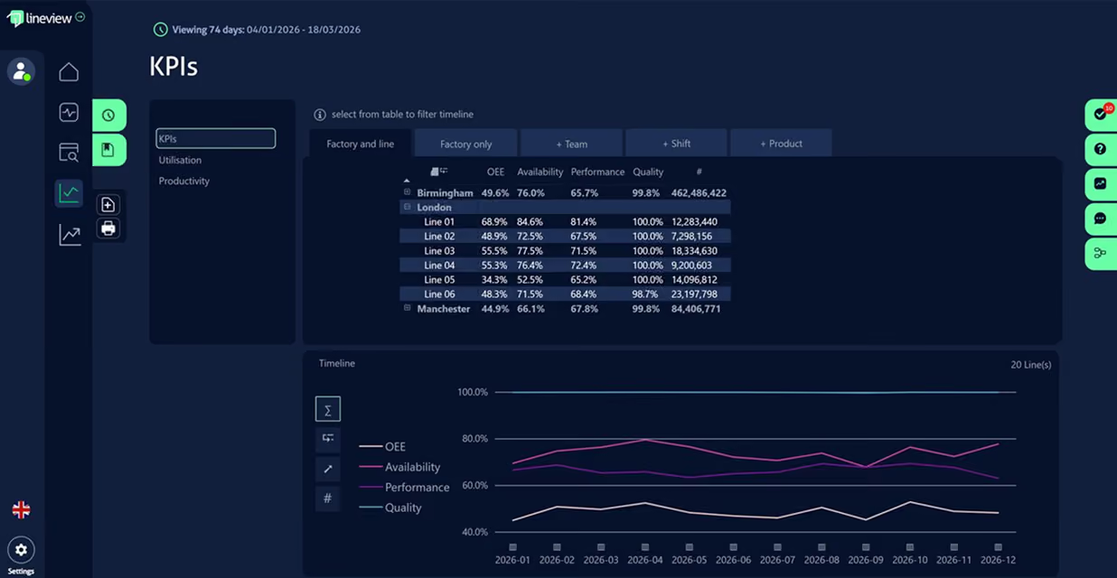
Deep-dive into OEE, availability, performance, quality and 29+ KPIs at line, site, or group level. Overlay targets, compare periods, and spot the trends that matter before they become problems.
Site Operations
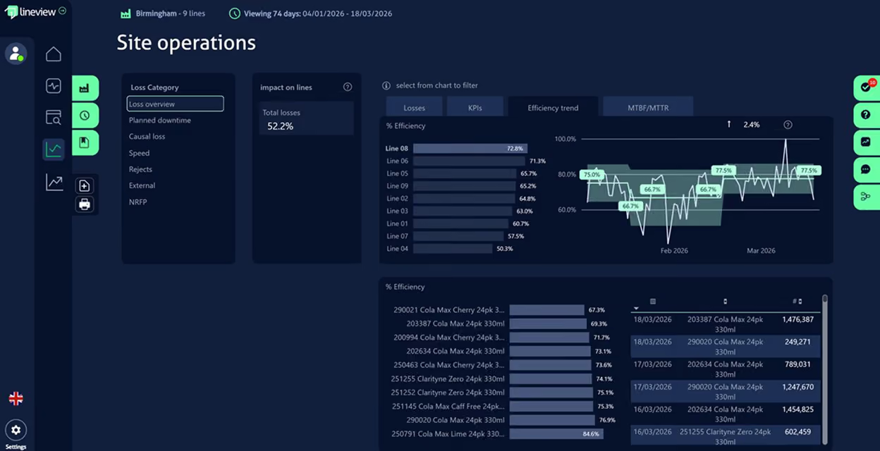
See every line at a site on one dashboard — OEE trends, top loss drivers, crew comparisons, and improvement trajectories. Built for site managers who need the complete picture without digging through multiple reports.
Engineering Analysis
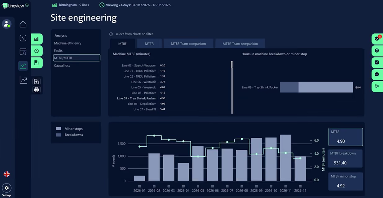
Track MTBF, fault frequency, and machine performance over time. Identify the equipment that needs attention before it becomes the constraint — giving engineering teams data-driven maintenance priorities.
Benchmarking
See how your sites and lines stack up against each other — and against anonymised industry peers. Identify the performance gaps worth closing and the best-practice sites to learn from.
Advanced Analytics

Site IFA Scorecard
Micro-stoppages under 30 seconds rarely appear in manual logs. Navigator captures every one directly from PLC signals, then ranks their cumulative impact. On most lines, this is where the biggest recoverable capacity sits.

Engineering & Maintenance Dashboards
Equipment fault history, stop frequency by machine, MTBF trends, and failure patterns, giving engineering teams the evidence to shift from reactive maintenance to scheduled intervention.

Usage & Engagement Analytics
Track how Navigator is being used across your organisation, which screens are accessed, by which roles, how frequently. Low engagement on a specific site or module is usually a signal for targeted coaching, not a data problem.

Production Output in KPI Dashboard
OEE in isolation is incomplete. Analyse includes actual production output in the KPI dashboard, so teams see both how efficiently lines ran and how much they produced against plan.
Loss vs. Total and Run Time
View losses as a percentage of both total available time and run time. The distinction matters: a line running 80% OEE on 60% availability has a different problem than one running 80% on 95% availability.

IFA Site Dashboard
A strategic-level view showing trends, site comparisons, and the correlation between IFA adoption scores and OEE outcomes, built for operations directors who need a monthly performance narrative, not a raw data export.
